PRYCE BATEY
BEYOND THE ZERO
︎︎︎
DESIGN COLLLECTION N°1
A SMALL SELECTION OF GRAGPHIC DESIGN, PRINT MATERIALS, AND DIGITAL ADS FROM 2022-2025
A SMALL SELECTION OF GRAGPHIC DESIGN, PRINT MATERIALS, AND DIGITAL ADS FROM 2022-2025


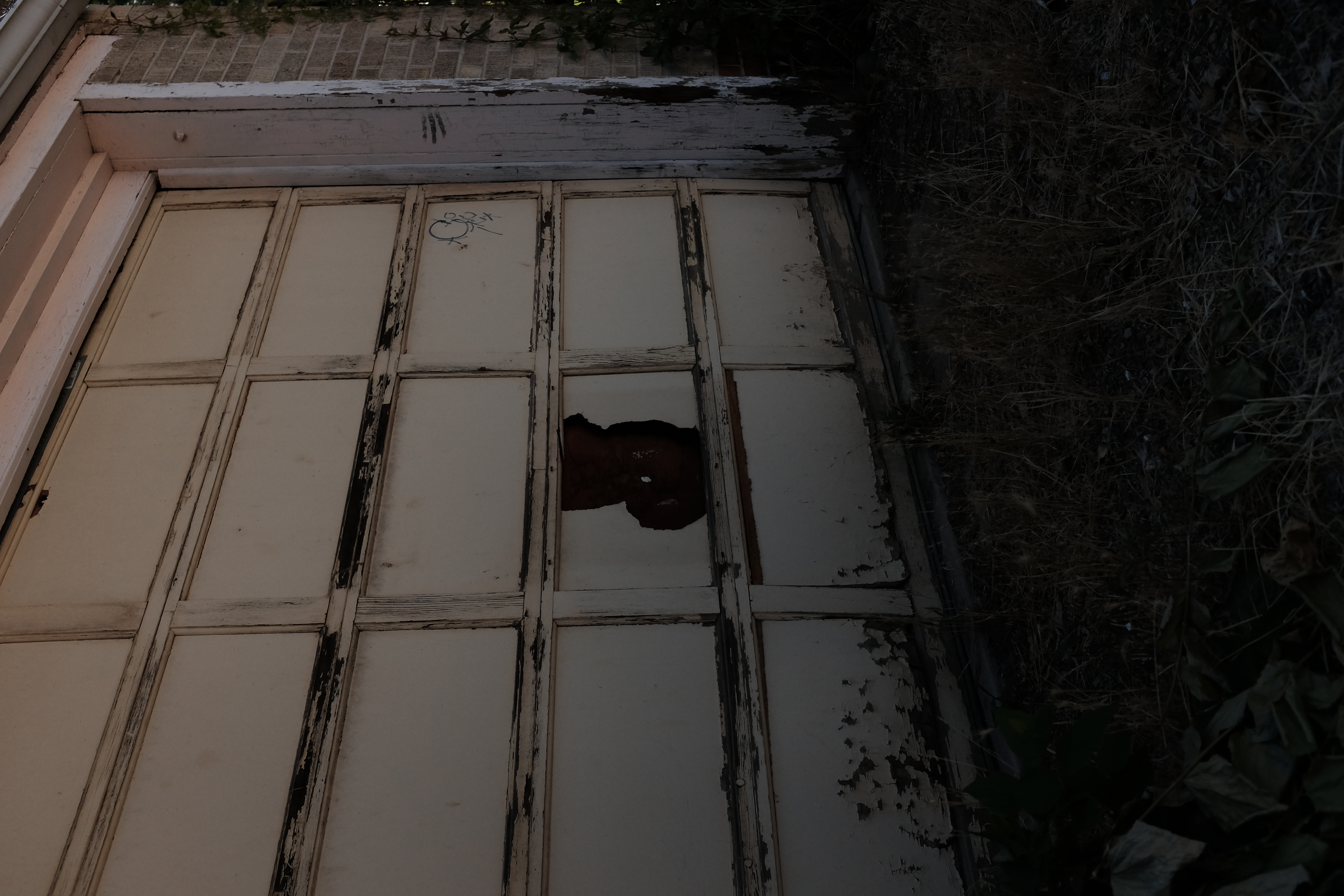
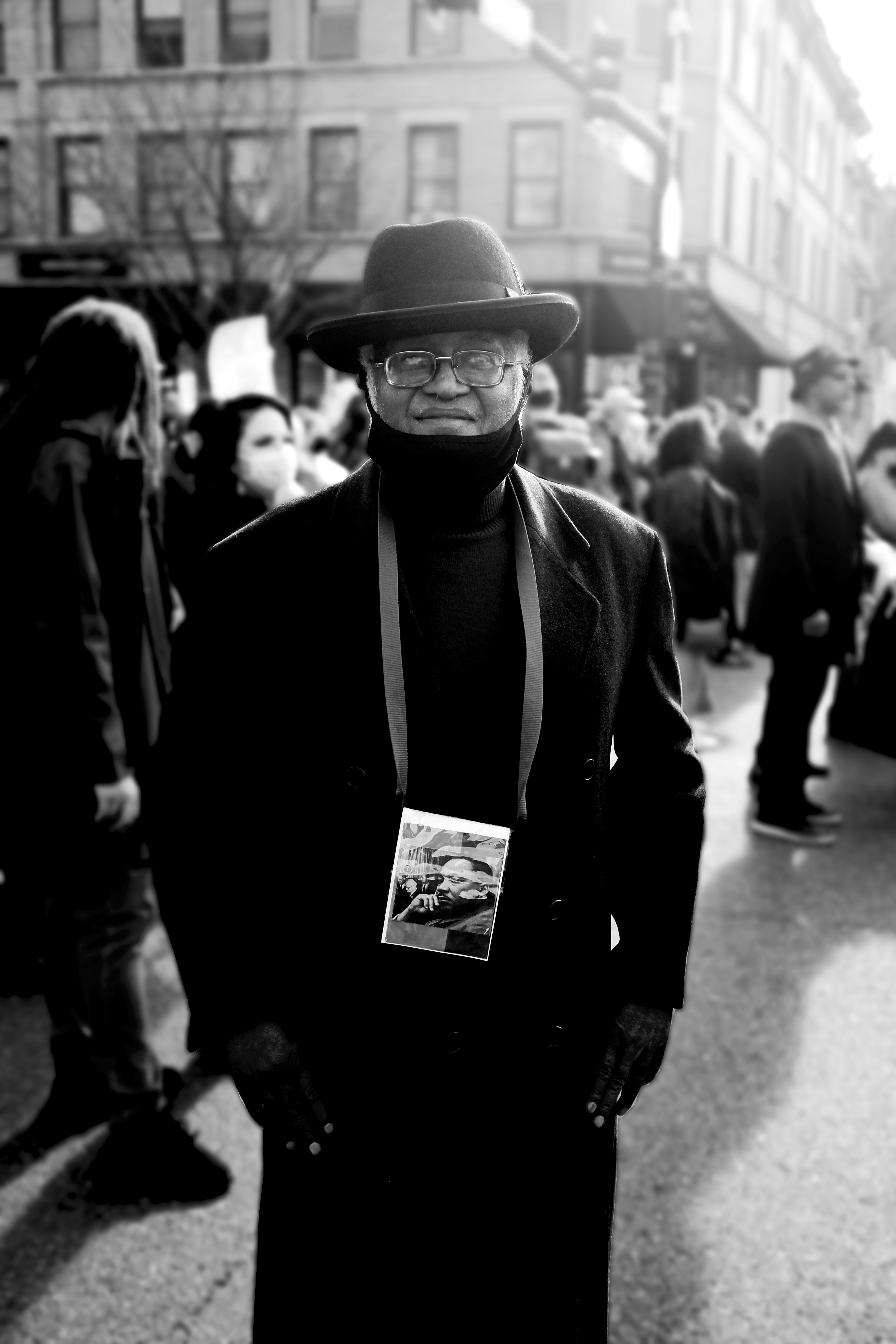
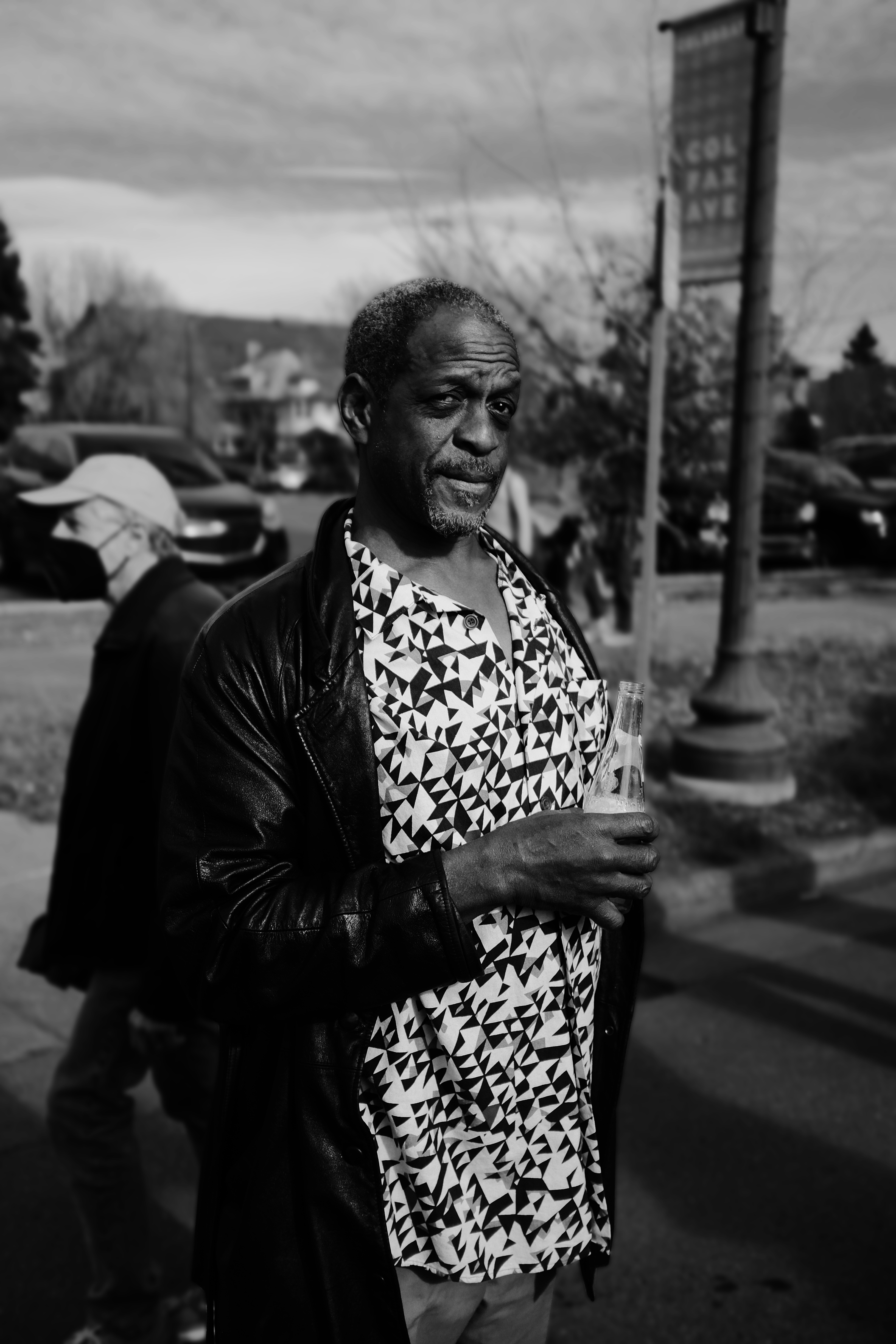
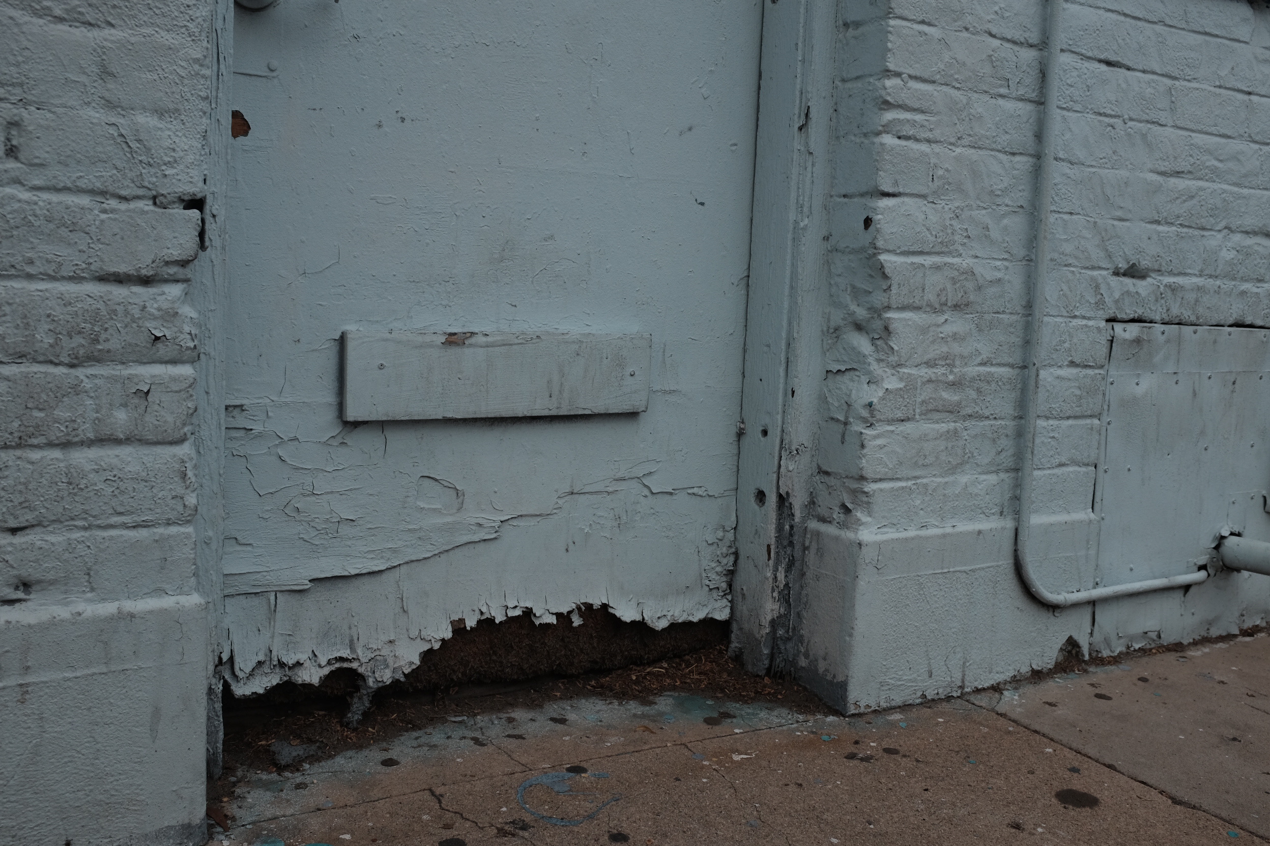
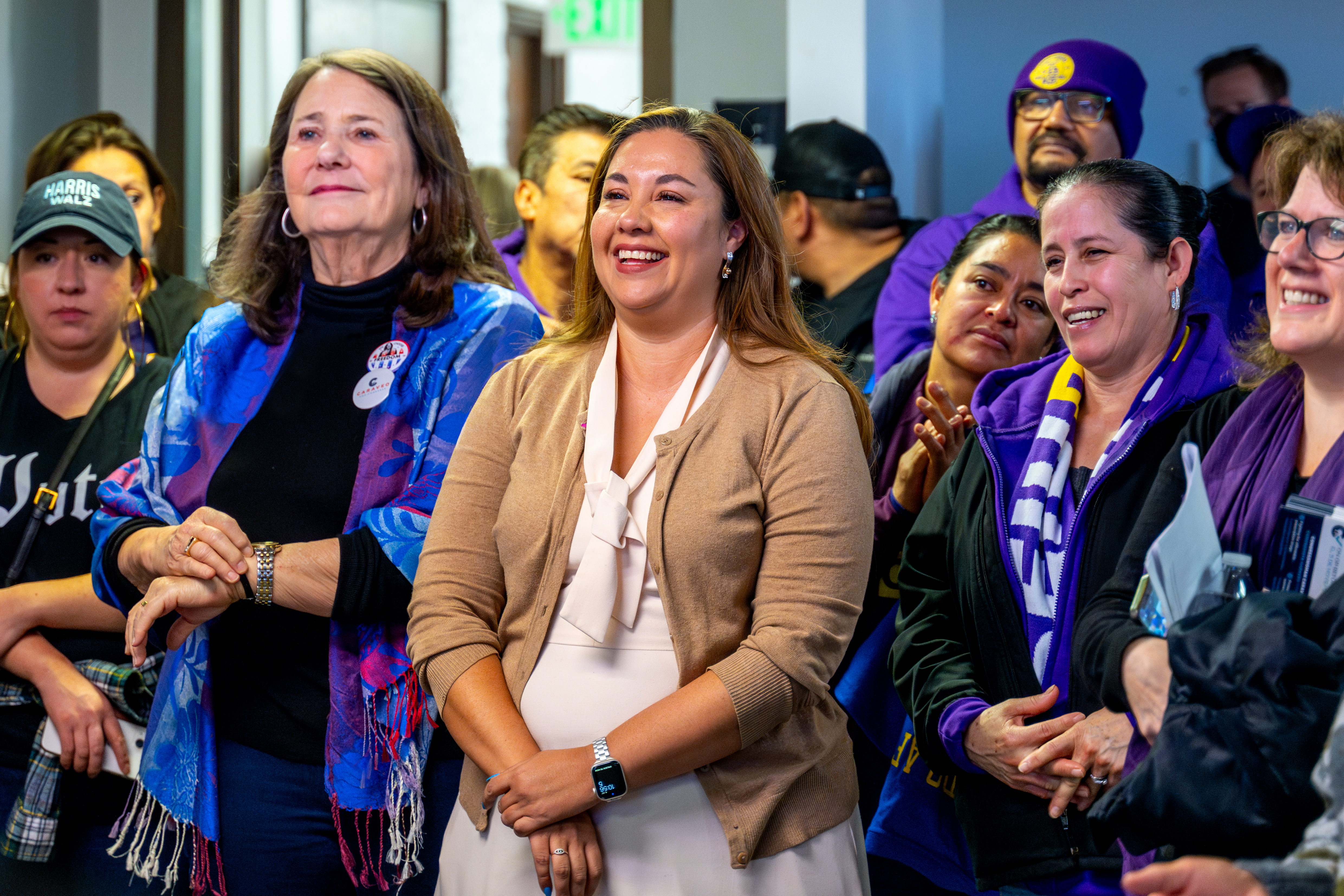
PHOTOGRAPHY COLLECTION N°1
A SMALL SELECTION OF PHOTOS TAKEN 2023-2025
A SMALL SELECTION OF PHOTOS TAKEN 2023-2025


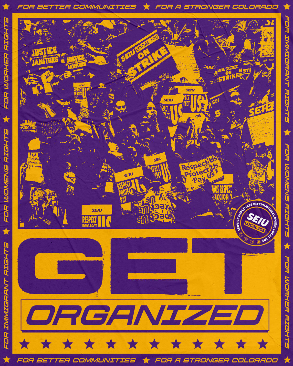
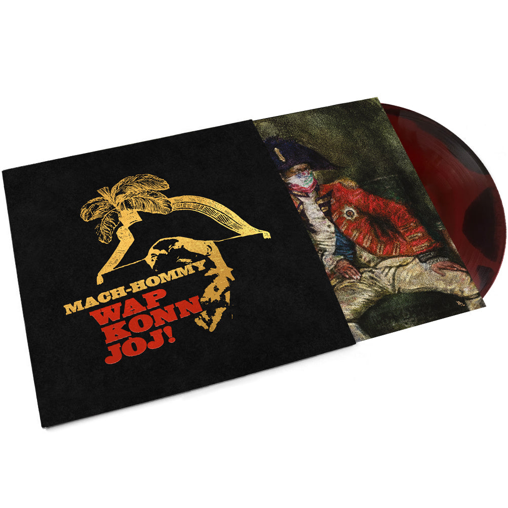
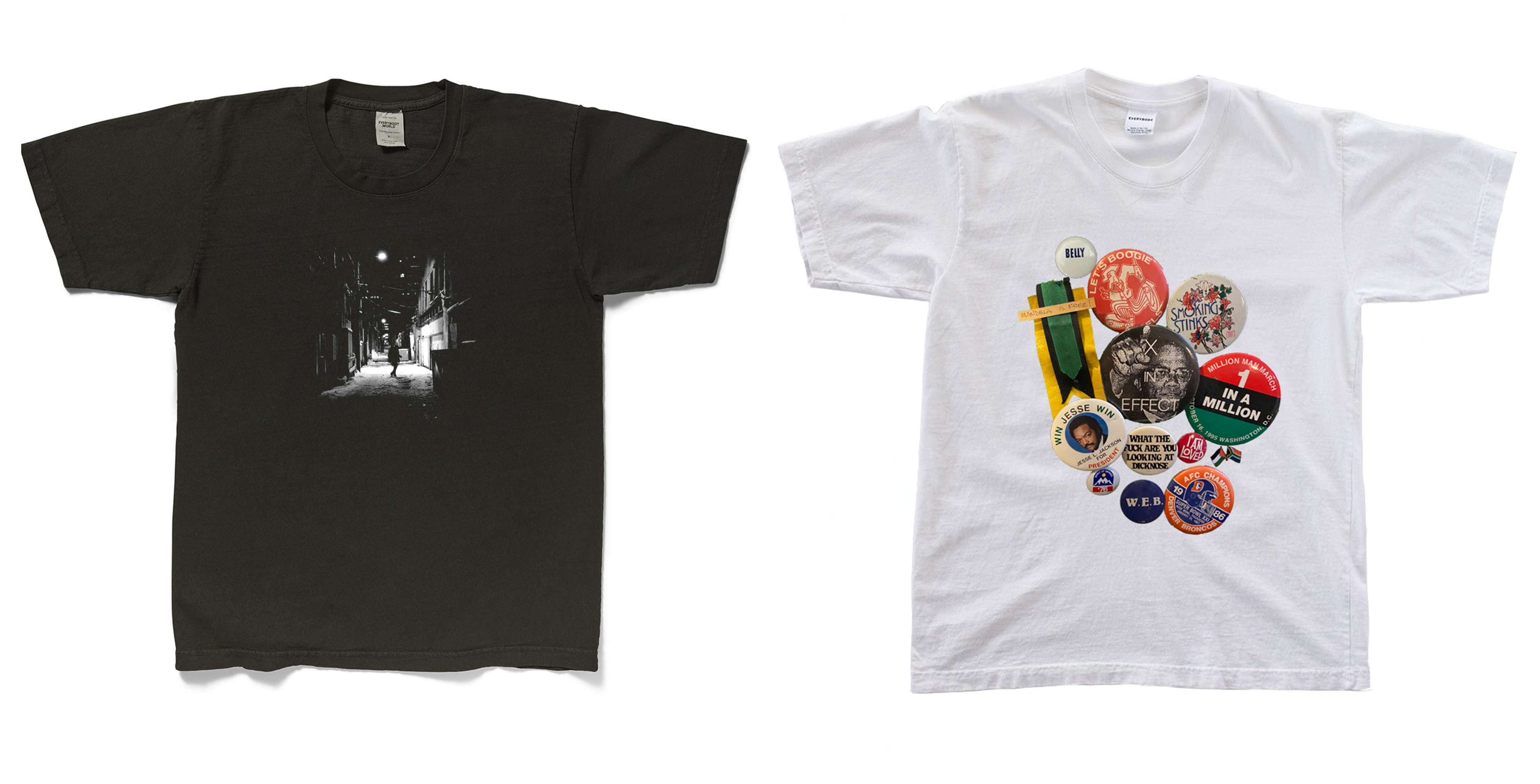
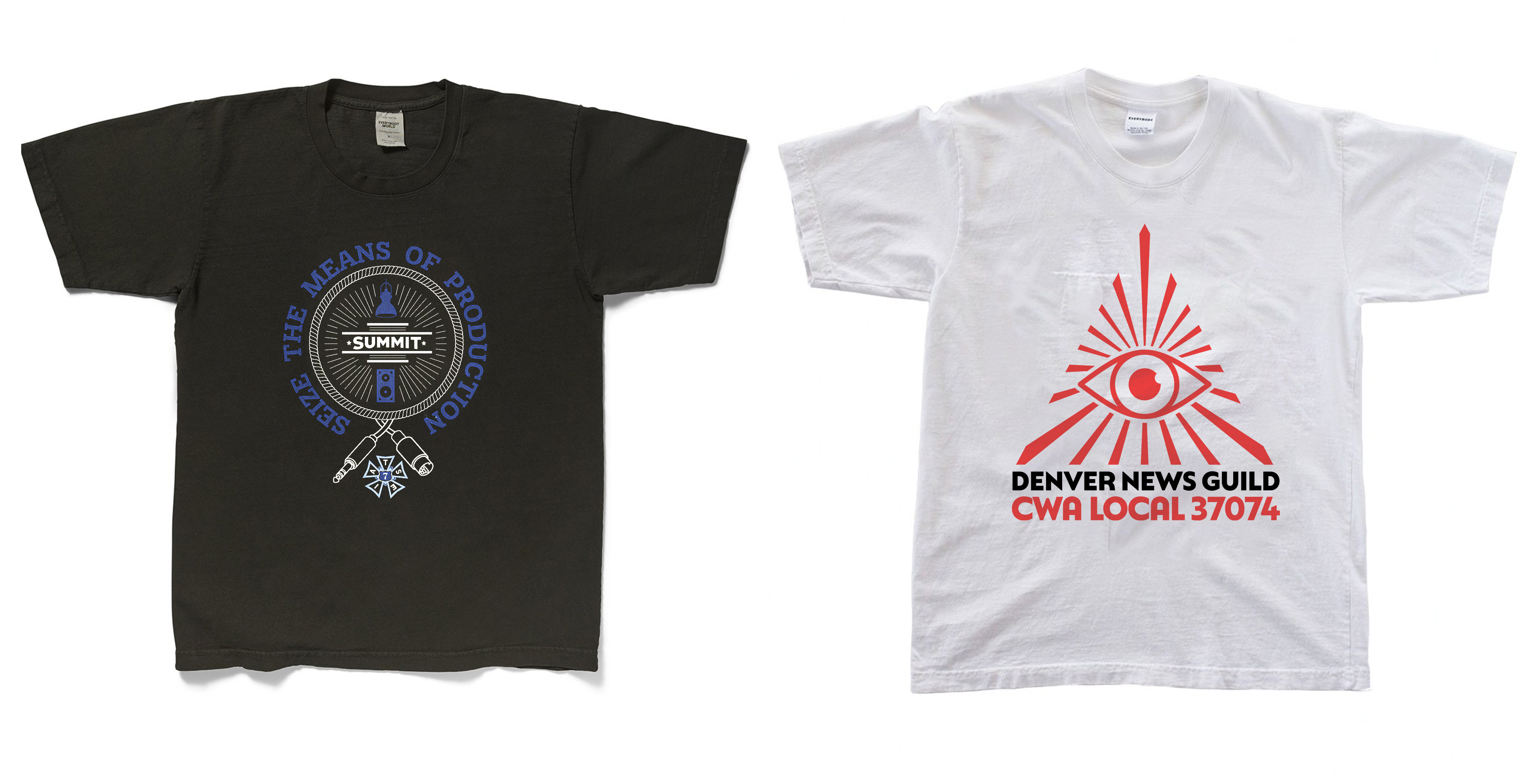
DESIGN COLLLECTION N°2
A SELECTION OF PERSONAL AND FREELANCE PROJECTS FROM 2021-2025
A SELECTION OF PERSONAL AND FREELANCE PROJECTS FROM 2021-2025


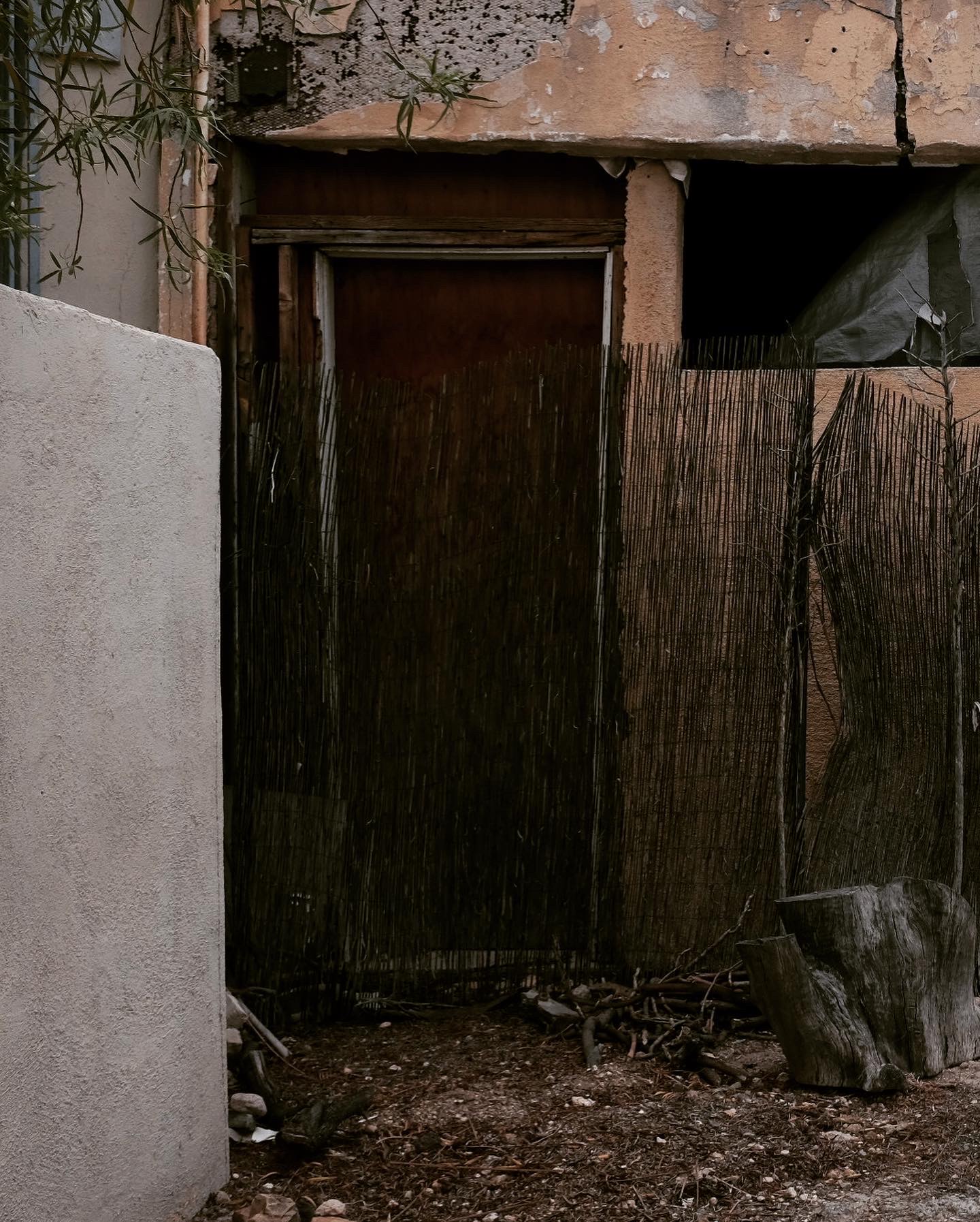
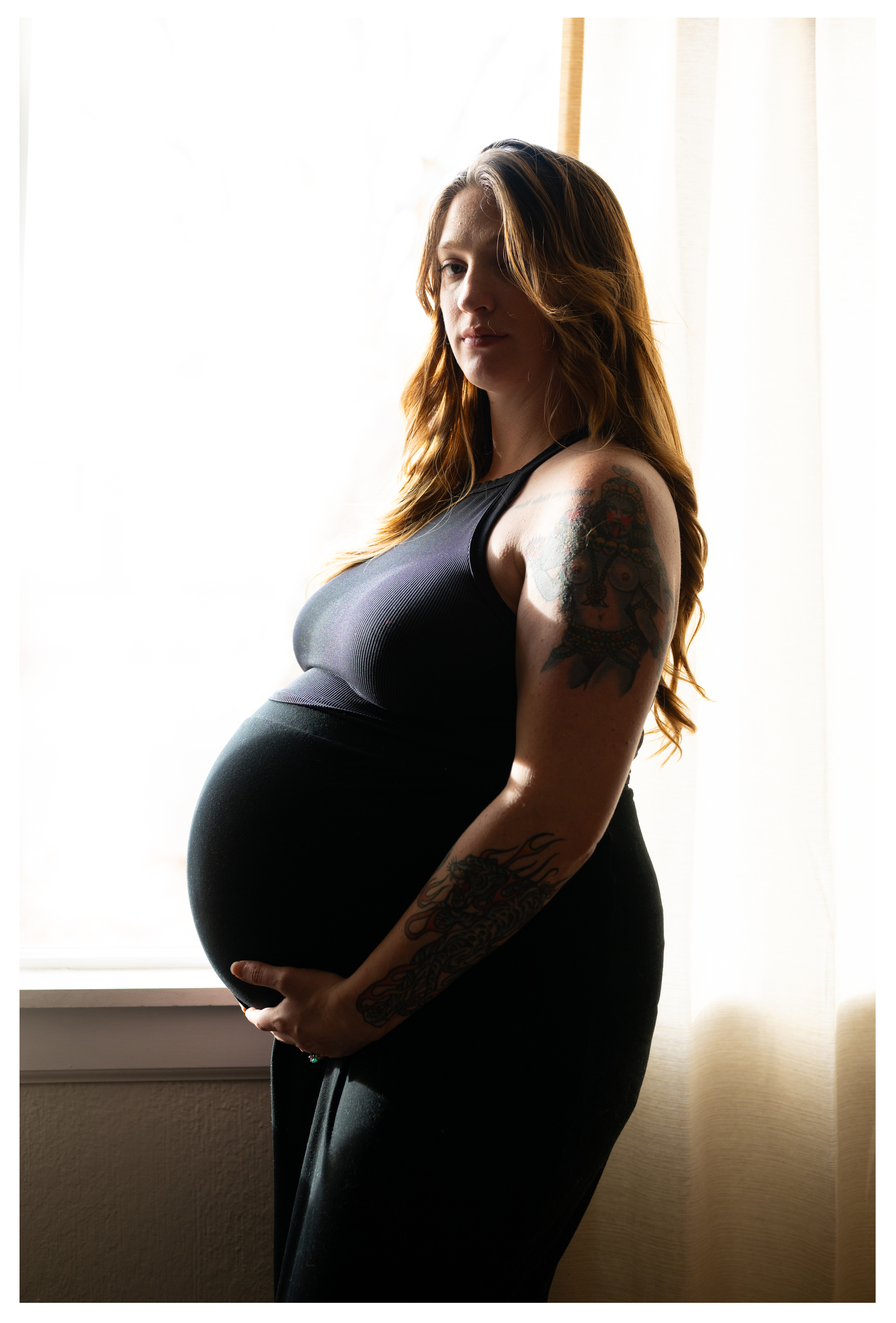
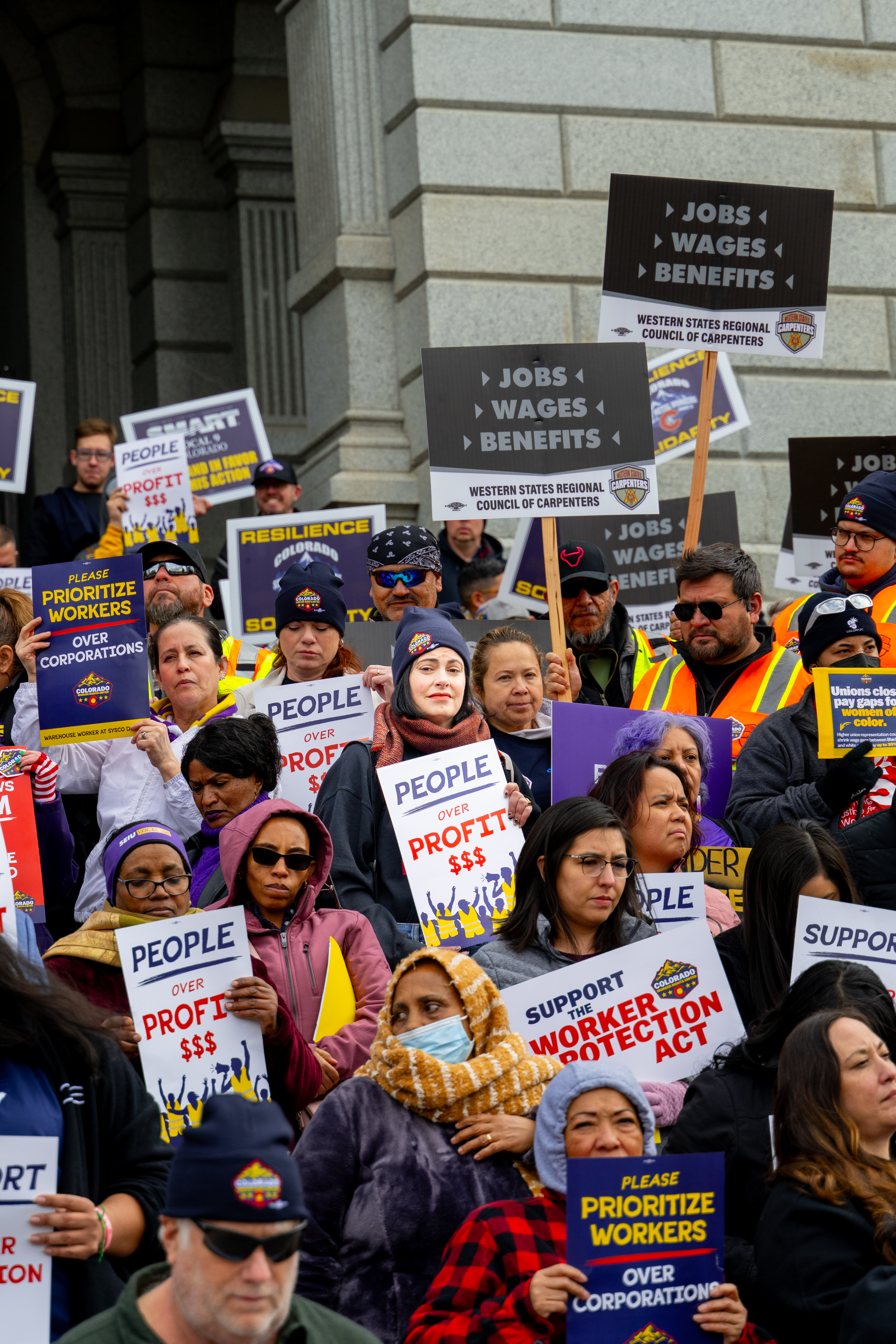
PHOTOGRAPHY COLLECTION N°2
A SMALL SELECTION OF PERSONAL AND FREELANCE PHOTOS TAKEN 2015-2024
A SMALL SELECTION OF PERSONAL AND FREELANCE PHOTOS TAKEN 2015-2024